
A few weeks ago morluto/rea blew up.
REA: reverse engineer anything.
 morluto / reaReverse engineer anything with agents, from app behavior down to native binaries.TypeScript456.3K stars112K forksView on GitHub
It took off mainly because it made it easy to go after software. But that didn't leave out games, brands, video editing, etc. Anything with a surface you can study.
Then came a slew of copycats going after Adobe.
Ars Technica ran one story as "Software is over": Artcraft used Opus to build open source clones of seven Adobe apps, from Photoshop to Acrobat.
Just with Opus 5.5, a goal and a loop. The clones are getting close enough that a screenshot can still fool you.
At work, we even advised a partner to use it to replace software they paid EUR 400k a year for. They did it, and now they own it. With the 'benefit' of maintenance, but the "opportunity" of control.
Now it's expanded past software. Look at snippets from my X feed.
People are pairing REA with tooling. For example, using the REA mentality combined with marketing skills that reverse engineer how a company goes to market and where its primary channels are:
 Corey Haines@coreyhainescoThe biggest thing I've shipped since Marketing Skills itself!
🆕 skill: /reverse-engineer-marketing — see how any company actually grew using public data.
Give it a domain and it:
→ Charts their monthly Google traffic and brand searches
→ Dates every launch, price change, ad…623 likes51 repliesHas a videoRead on X
People are going after personal brands:
 Treg@treg_aiAditya built a /rea-brand skill for reverse engineering anyone's personal brand.
Powered by @treg_ai.21 likesView on X
It's even becoming a whole marketing trend to REA something:
 MAX@maxxmalistyou can literally break down any ad or video into pieces
extract:
– pain points
– angles
– hooks
reverse engineer them and run them for your brand, it’s never been this easy304 likes6 repliesView on X
Many friends of mine who are creators are understandably upset about it.
Their novel moment, viral video, hard crafted aesthetic has been ripped n' replaced by others overnight, or just in time.
The moment they put out a video and it performs as an outlier, it explodes with clones breaking it down layer by layer: visuals, transcript, hooks, editing, on-screen displays, etc.
This happened to me too for software I built, but I realized everything I made was an improvement or a newer version of everything else that came before me, and so on and so forth.
The point is: it hits everything.
Why I care
I keep Pinterest boards for everything I find beautiful in design. Making something intuitive and beautiful is 100x harder than just ripping something off. You have to be exposed to the small frictions and scars to know how to avoid them, and that's where domain expertise helps.
Think of it as a Pareto principle. 80% you can do quickly, but the last 20% is going to take 80% of the time.
I wanted to compress that. Let's look at Granola, whose brand I have fallen in love with because they combine a modern, extremely intuitive product with a fresh, handwritten, handcrafted feeling.
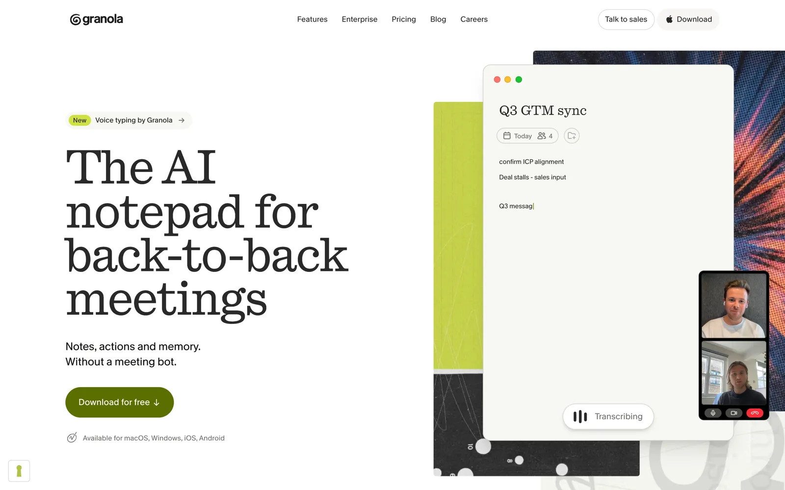
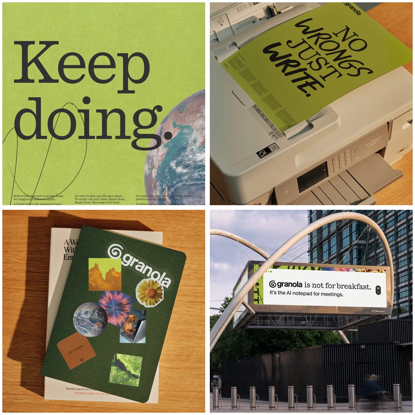
They mix unlit objects, scrappy collage, handwriting and craft stuff, and build multi-layered collages that switch and re-cut themselves on top of flattened 3D objects. A microphone, a cursor, a moka pot, headphones.
Each one is plain and chunky and you get it instantly, and every surface is a scrap of something printed.
Crazy GOOD.
The identity is by Ragged Edge. Full credit to them, and their case study is worth the scroll:
They call the collage objects "findings". And they didn't hand-make every one. They built the Granola team an in-house tool, the Findings Generator: you type what to make, a feeling and a metaphor, pick a colour and hit Generate.
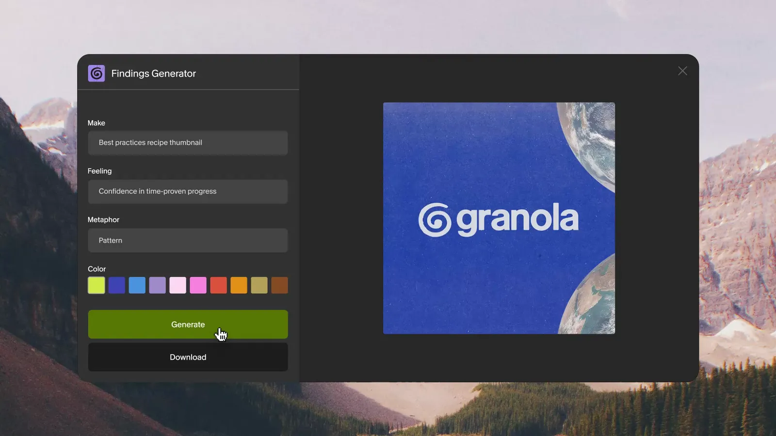
So there are rules underneath. Rules you can run, which means rules you can work out.
Here's their set of objects, each one labelled with what you do in the app:
Btw it worked. Per Ragged Edge, Granola was the No. 1 trending topic on X on launch day, and hit a $1.5 billion valuation within three months of the rebrand.
I want to do that.
...so I tried to reverse engineer it. Good artists steal, right?
What I ended up with
Theirs on the left, mine on the right. Same rules, my own objects, images, and colours, for distribute.software, my AI news aggregator.
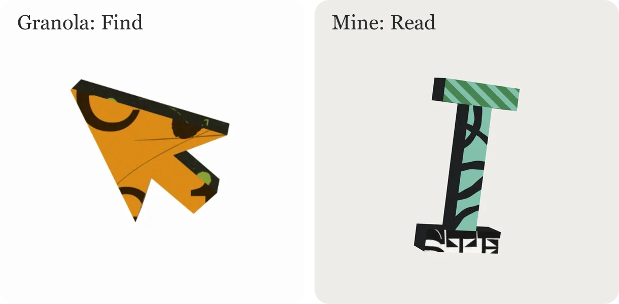
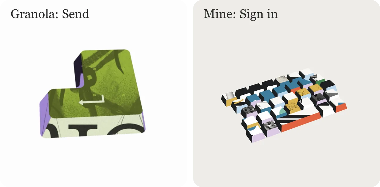
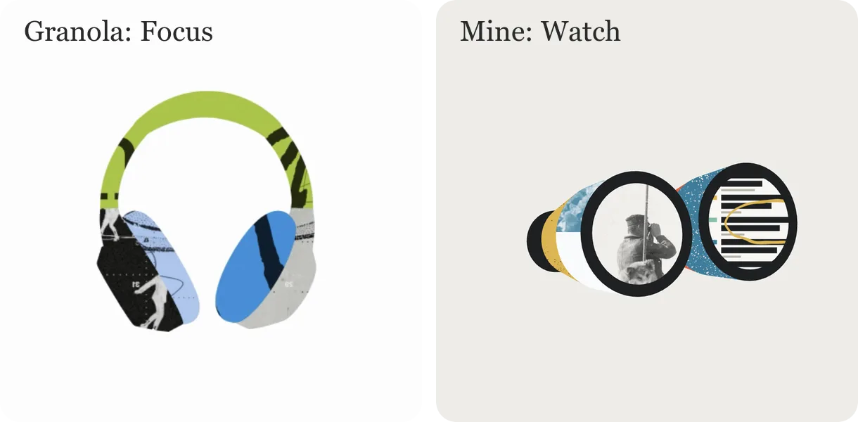
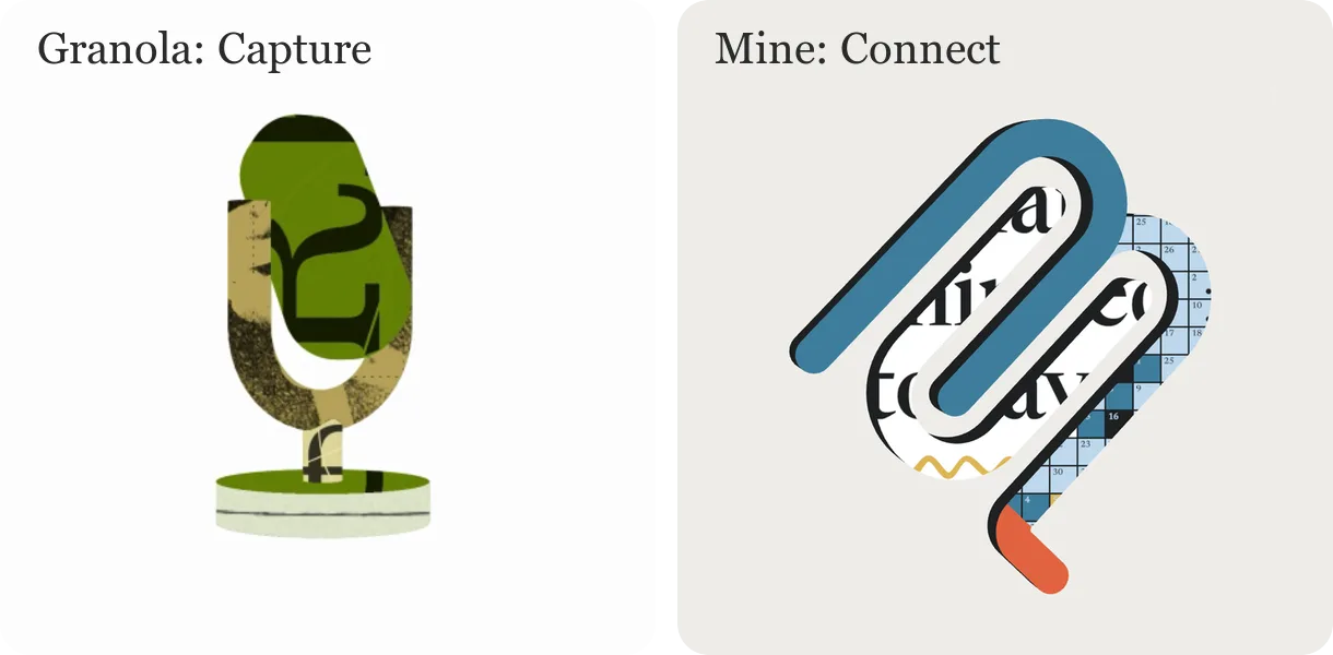
Granola's objects are Ragged Edge's, frames from their case study. What I took from them:
- flat parts
- no lighting
- artwork cropped by the edge of each part
- two colours plus ink per object
The objects, colours and scraps are mine.
Here's how I did it:
- the analysis
- every layer of the rebuild
- how it shows up on the site
- the numbers from the session logs
- the skill file at the end, so anyone (or any agent) can do it again
Step 1: Take the reference apart
It started with this:
First I wanted to understand the layers inside it. What goes into a brand system like this?
I'd saved two clips of Granola's objects on Pinterest, about 15 seconds at 60fps between them. Gave them to Opus 5.5 in Claude Code and had it split them into frames and go through them in passes:
- 1 and 2fps for an overview
- 6 and 12fps, cropped to single objects
- 10fps with timestamps burned in
- the full 60fps, to see exactly what changes between two frames
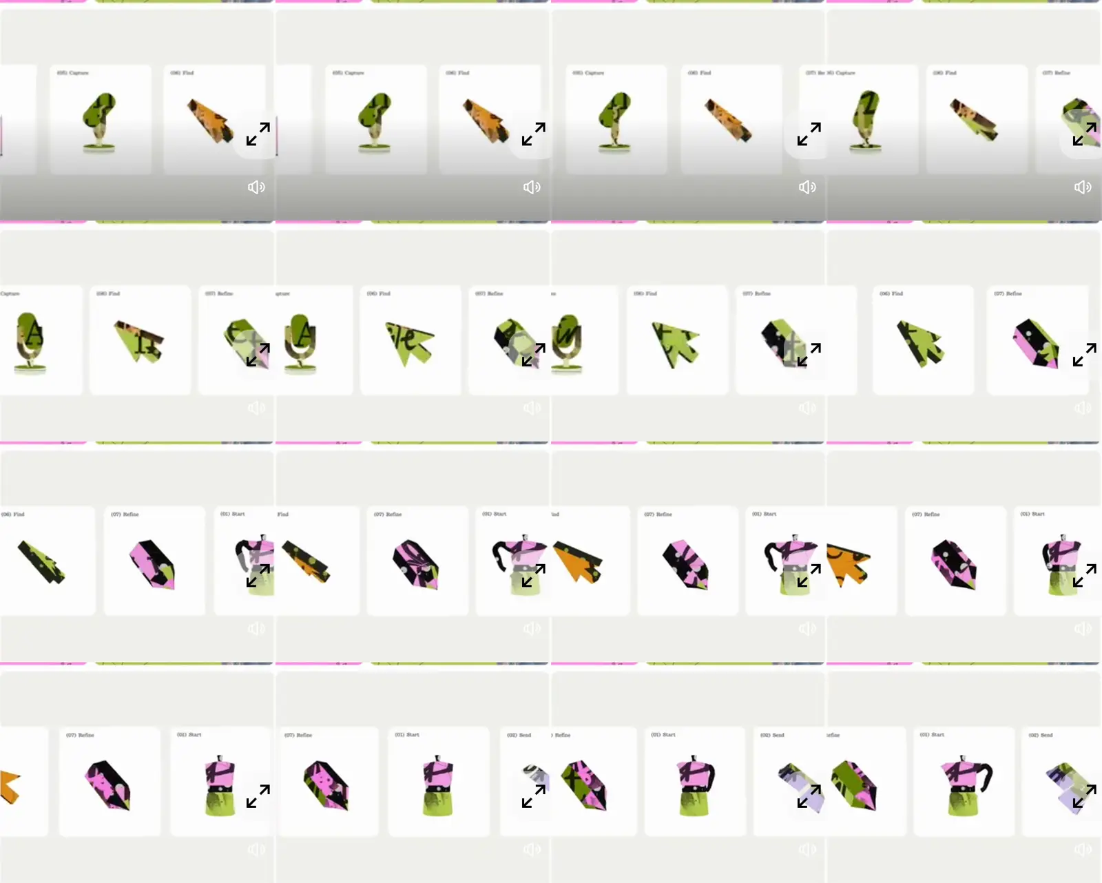
Each pass looked at one thing:
- animation style
- type
- the parts of each object
- colours and how they balance
- how the scraps combine
- lighting
- motion
(All done in about an hour btw.)
The 60fps pass is where the answer was. Two frames of the microphone, a fraction of a second apart:
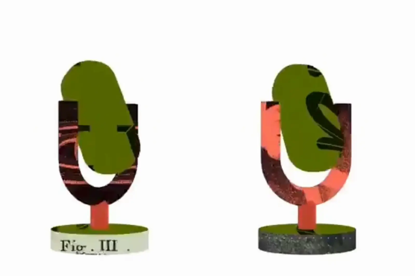
The shape barely moves. Every part gets new artwork. Ragged Edge's hover cards do the same thing, swapping the whole collage behind the text:
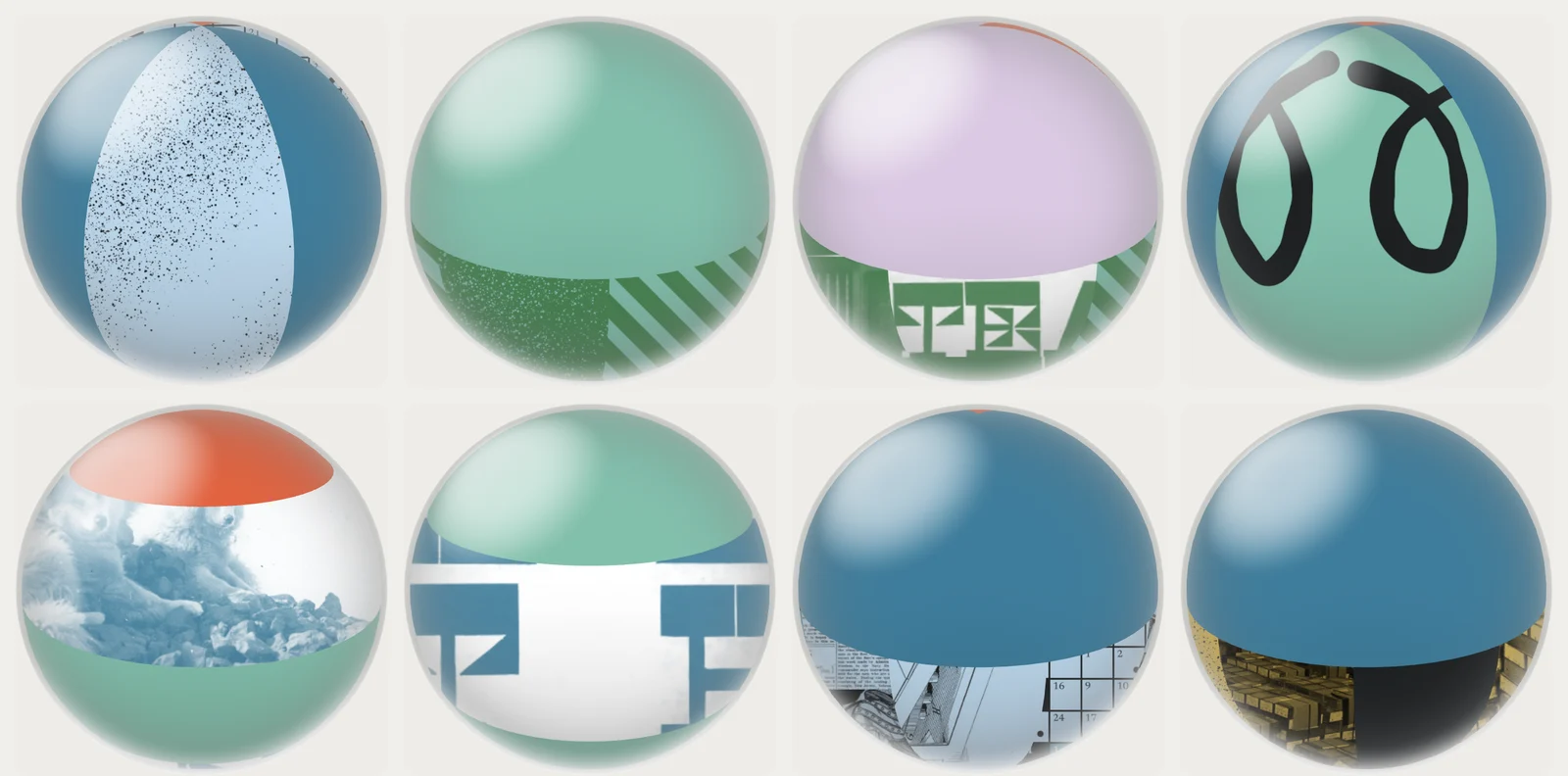
I do the same on the avatar. Hover your orb and the collage under the glass gets re-cut, eight times a second:
What the passes found:
| Layer | What Granola does |
|---|---|
| Lighting | None. No shading, highlights or shadows. You read 3D only from the silhouette and the borders between parts. |
| Artwork | Flat sheets fixed to the screen. The object is a window onto them, so lettering never squashes as it turns. |
| Motion | Stop-motion. About eight times a second the object snaps to a new angle and every part gets new artwork. Nothing glides. |
| Colour | Two colours plus black and a light neutral per object. Lime and blue headphones, olive and salmon microphone. |
| Texture | About half of every object is plain colour. The rest is brush lettering, black-and-white photo scraps, engravings, halftone and a serif "Fig. III" caption. |
| Gradients | No smooth ones. Colour only thins into another colour through grain. |
| Scale | Artwork is way bigger than the part, so the edge of each part crops it like scissors. |
Most of that hour was me saying "no, look again".
Step 2: Rebuild it in code, get it wrong twice
I didn't want to copy Granola's objects. I wanted the method, on my own thing: distribute.software, my news aggregator for the day's tech news.
So I picked objects for what people do there. My actual ask:
Which became:
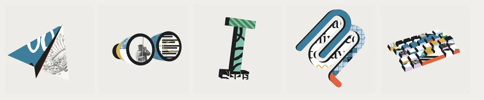
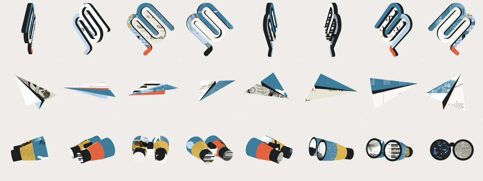
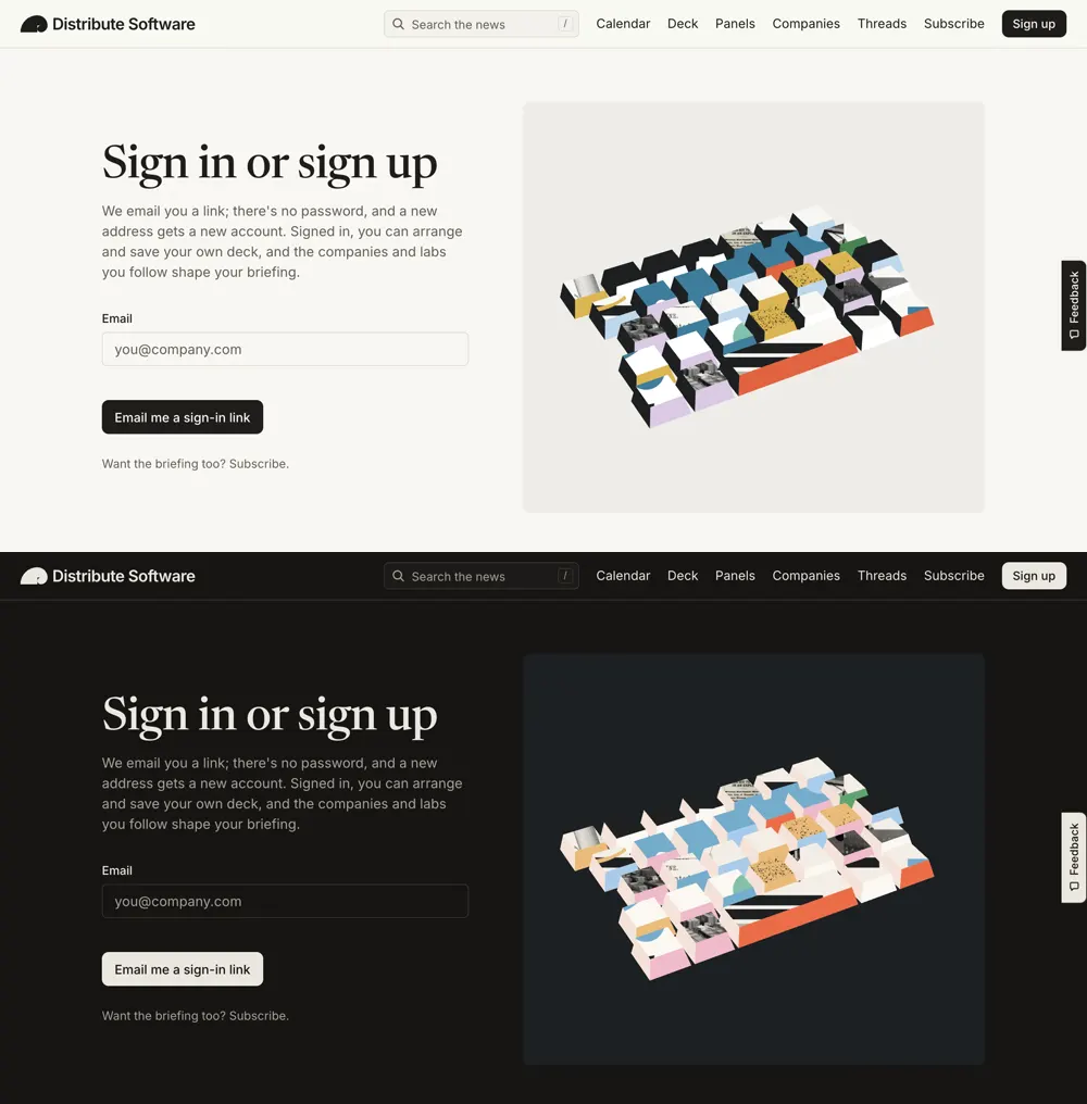
- A sea of keyboard keys, cause somebody typed all of this.
- Binoculars, cause readers are watching what ships.
- A paper plane, cause you can subscribe on Telegram.
- The I-beam text cursor, for reading.
Everything is drawn in code with three.js. No model files, nothing drawn by hand.
First prototype was on screen 12 minutes after I sent the first clip. It was also wrong.
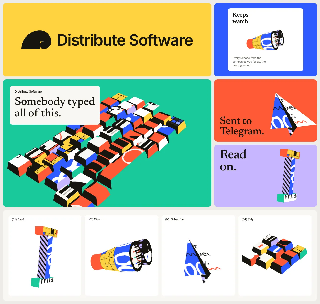
The artwork was wrapped onto the surfaces, so it turned and squashed with the object. That's what makes something look like any other textured 3D model. And I didn't like the keys bobbing in a wave.
Version 2 swapped the sway for a smooth turntable spin on hover:
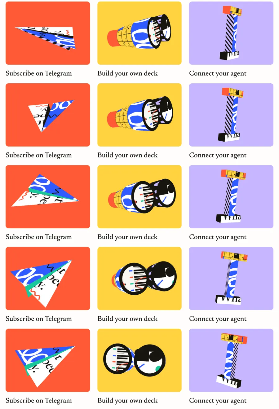
Still wrong. So I told it what I actually saw:
It went back to the first clip and fixed the artwork so it stayed still while the outline turned. Then I sent the second, closer clip:
It wasn't. Frame by frame, the second clip was stop-motion. That became version 3:
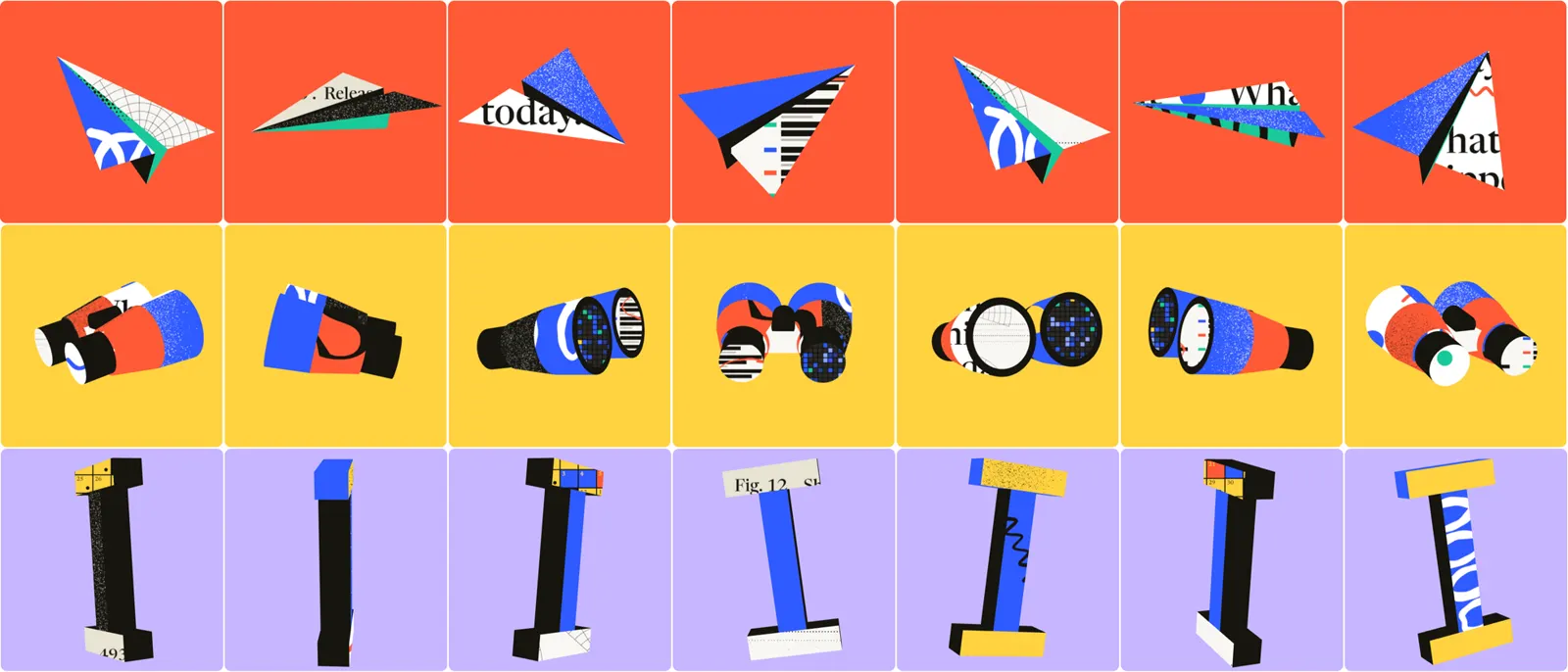
Step 3: Palette, three times
The colours were way too loud. I asked for Granola's balance in OKLCH, without their hues. Claude measured the colours from the clips and found three things holding their palette together:
- two lightness bands
- chroma that stays between about 0.12 and 0.18
- one hue used as a ladder of light, mid and dark
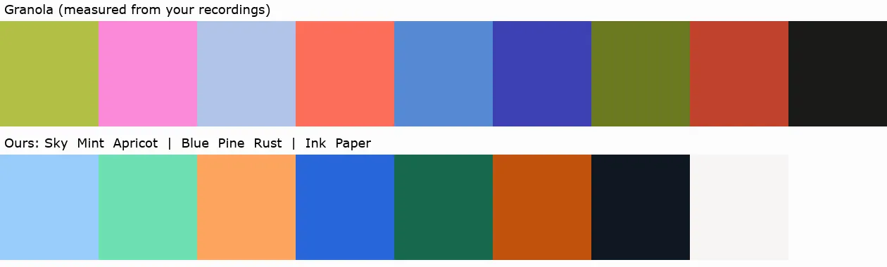
Better. Still not me.
So I went back to my own Pinterest boards and pulled four torn and cut-paper collages I love:
Claude measured those:
- dusty, papery colours with low chroma
- one hot coral in every image
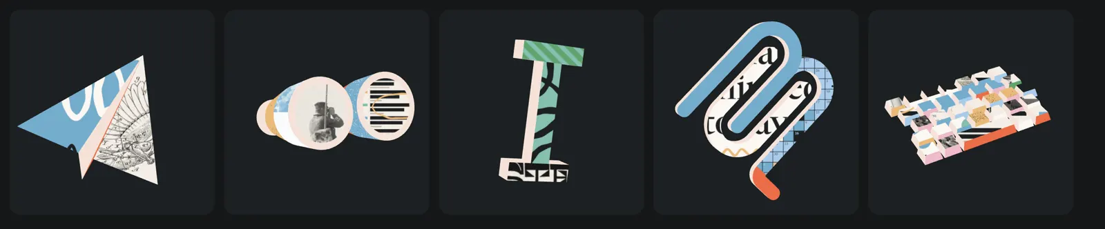
- quiet grounds: warm off-white by day, cool charcoal by night
That became the palette, light and dark:
| Colour | Light | Dark |
|---|---|---|
| Petrol | #3E7D9B | #75ADCD |
| Sky | #BDD8EC | #A9CCEB |
| Seafoam | #82C0AC | #85BFAE |
| Moss | #488452 | #60A46F |
| Mustard | #DCB652 | #EABB79 |
| Coral | #E1633F | #EB6D48 |
| Lilac | #DBCAE3 | #EFBACA |
- Every colour sits between 0.04 and 0.13 chroma in OKLCH, except coral at 0.165.
- Coral is the spark: one small part per object, never a background.
- Dark mode isn't the light palette dimmed. On charcoal the colours step up to pastels so they glow.
- In dark mode the dark faces turn cream, cause dark faces would sink into a dark tile.
The OKLCH values are in the skill file below.
Layer by layer
The finished system, from the bottom of the stack to the screen.
Layer 0: original material
I asked if we could use real public-domain material:
There's a lot of it. Claude:
- searched Wikimedia Commons
- kept only files whose licence data says public domain
- cropped out people and company names
- logged every source
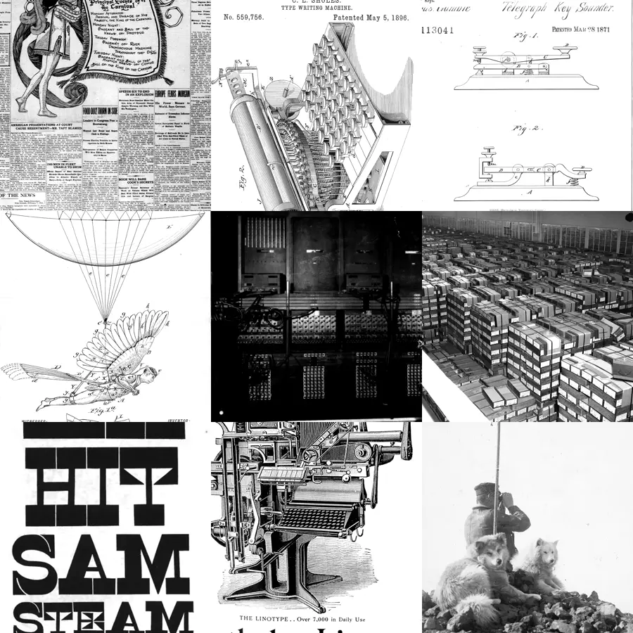
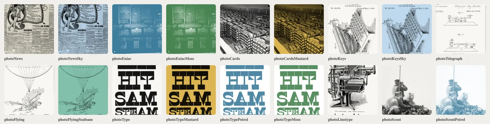
 News1910Columns and a carnival illustration from a New Orleans front page, masthead cropped out.Commons(opens Commons)
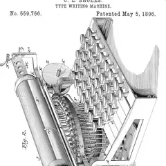 Typewriter1896The keyboard from C. L. Sholes's typewriter patent.Commons(opens Commons)
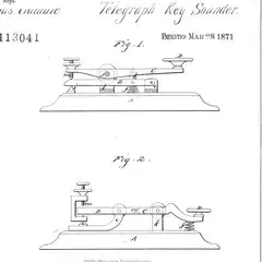 Telegraph1871Figures from a telegraph key patent.Commons(opens Commons)
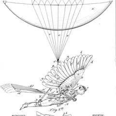 Flying machine1889A winged man under a balloon, from a patent.Commons(opens Commons)
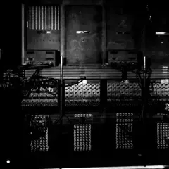 ENIAC1946Wiring panels, with the two programmers cropped out.Commons(opens Commons)
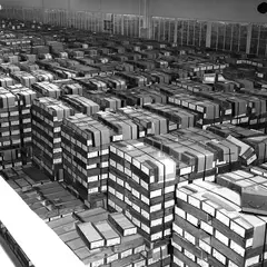 Punched cards1959A warehouse of boxed cards.Commons(opens Commons)
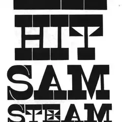 Wood type1840Slab letters from a specimen sheet.Commons(opens Commons)
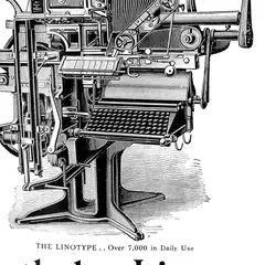 Linotype1900An engraving from an advertisement, maker's name cropped out.Commons(opens Commons)
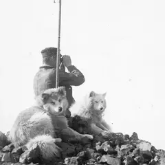 Lookout1899A man with binoculars and two sled dogs, Antarctica.Commons(opens Commons)


Layer 1: plain paper
Ten flat sheets: the seven colours, ink, paper and white. About half of every object is plain at any moment, so these do the most work.

Layer 2: drawn sheets
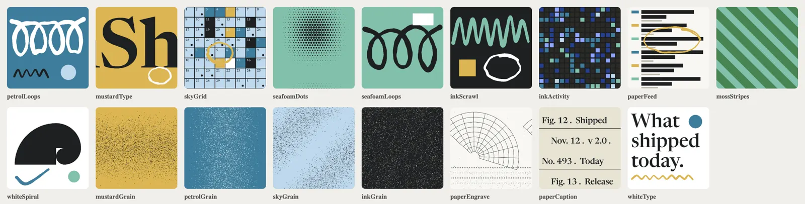
Eighteen sheets drawn with canvas 2D, each a palette colour plus one or two oversized motifs. Three kinds:
- Handwriting: marker loops, zigzags and rings drawn along jittered splines, with the stroke width wobbling.
- Print texture: grain that thins one colour into another, an engraving, a serif plate caption.
- Bits of distribute.software itself: calendar cells, feed rows, the activity grid, the spiral logo and a headline in the site's serif.
Layer 3: photos, recoloured
Each greyscale original gets printed onto a coloured sheet in the browser. Multiply puts the darks in ink on coloured paper, screen puts them in colour on white. 9 files become 18 sheets.
46 sheets total.
Layer 4: geometry
Each object is a handful of chunky parts:
- boxes, split into separate faces
- tubes, split lengthwise into two halves, so half a turn brings new artwork round
- flat folds
Every part has a short list of about four cuttings in its object's two colours plus ink and paper. One or two plain, the rest patterned or photo.
Layer 5: the window shader
This is the trick. Every part looks up its sheet by where the pixel sits on the screen instead of where it sits on the object. So the artwork stays upright and undistorted however the object turns, and the edges of the parts crop it like scissors.
vec2 p = (gl_FragCoord.xy - centre) / unit;   // screen position in world units
vec2 q = vec2(p.x * turn.x - p.y * turn.y, p.x * turn.y + p.y * turn.x);
gl_FragColor = texture2D(map, q / scale + at);
#include <colorspace_fragment>
No lights in the scene, and a long 20° lens keeps the objects reading as graphics instead of renders.
Layer 6: stop-motion
- At rest an object is drawn once and costs nothing.
- While you hover its card, every 125 ms it snaps a twelfth of a turn and every part takes the next cutting in its list at a fresh offset.
- When the pointer leaves, it plays on to a resting pose and stops. No easing, gliding or reversing.
- Touch doesn't trigger it, and with reduced motion nothing plays.
How it shows up on the site
The objects only matter in context. Here's where they live on distribute.software.
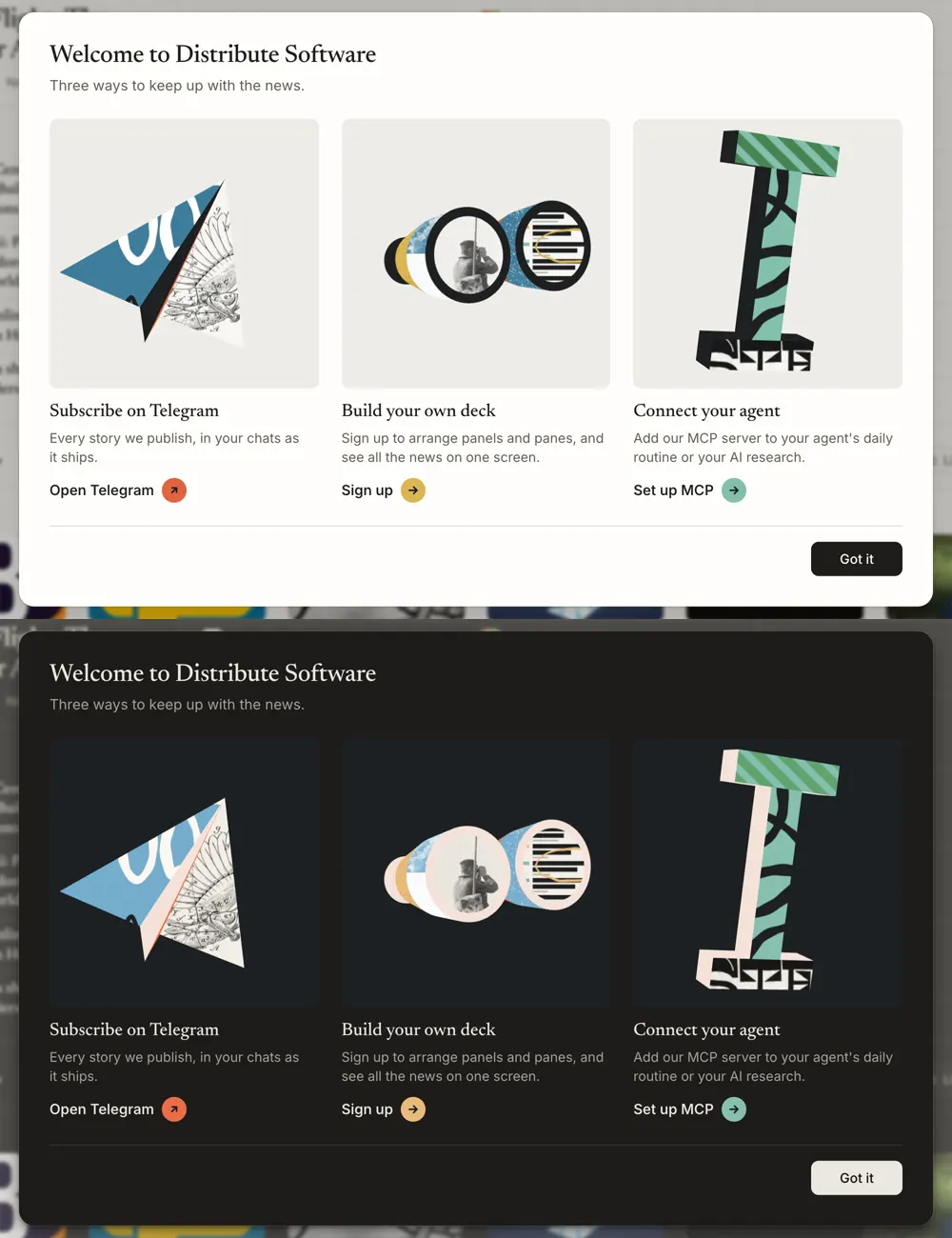
First, the welcome cards. Three ways to keep up with the news:
- the plane, for Telegram
- the binoculars, for building your own deck
- the cursor, for connecting your agent
The whole card is the link. Hover anywhere on it and the object plays, the arrow slides out of its badge and an underline draws in the badge's colour.
Sign in gets the sea of keys, still until you hover the tile.
The "connect your agent" card uses the MCP logo itself, its three strokes swept into chunky ribbons with ink walls. Petrol and sky with a printed page, and the hooked foot in coral, the one hot accent.
The site's spiral logo is one of the drawn sheets, so it turns up as a scrap inside the collage instead of sitting on top of it.
And when you sign in you get an orb as your avatar. A sphere cut into gores, bands or a checker, in two colours picked from your account ID, sometimes with a coral segment. It's the one lit thing in the whole system. First version looked flat:
So now a fixed glass shell sits over the collage with:
- lens falloff
- a fresnel rim
- one soft highlight
The numbers
About two hours, 14 prompts (603 words) from me, and 163 tool calls from the agent. Most of my words went on corrections: where the artwork lives, the motion, the palette.
The full breakdown, from the session logs
All of this comes from the Claude Code session logs for the distribute.software workspace on 12 November 2026.
The reference
| Input | |
|---|---|
| Clips of Granola's objects, saved from Pinterest | 2, totalling 15 seconds at 60 fps (about 900 frames) |
| Frame-extraction passes | 8, at 1, 2, 3, 6, 10, 12, 30 and 60 fps |
| Reference stills and contact sheets the model studied | 16 |
| Palette references from my Pinterest boards | 4 |
| Time from first clip to the correct stop-motion read | 68 minutes |
The work
| Main session | |
|---|---|
| Wall-clock time | 2 h 3 min |
| Prompts I wrote | 14, totalling 603 words |
| Tool calls by the agent | 163 |
| Images the model looked at | 65: 16 of the reference, 49 of its own renders |
| Output tokens | 220,733 |
| Input tokens processed, mostly cache | 32.2M |
The orb avatar was a separate 18-minute session: 3 prompts (92 words), 56 tool calls and 41,696 output tokens.
The corrections
Most of my 603 words went here:
| What changed | Versions |
|---|---|
| Where the artwork lives | 2: wrapped on the surface, then fixed to the screen |
| Motion | 3: sway, then a turntable spin, then stop-motion |
| Palette | 3: bright primaries, then Granola's structure in other hues, then measured from my own references |
| Times I asked "are you sure?" | 2, and both times it wasn't right |
The output
| Output | |
|---|---|
| Objects | 6: cursor, binoculars, plane, keys, MCP mark, orb |
| Sheets | 46: 10 plain, 18 drawn, 18 photographic |
| Public-domain photographs | 9 (636 KB) |
| Lines of code | 1,577 (scene 860, sheets 484, orb 80, CSS 101, component 52) |
| Model files and hand-drawn images | 0 |
| three.js, loaded only where an object appears | about 135 KB compressed |
| Frame length | 125 ms (8 fps), 12 frames per full turn |
| Skill files | 2: one for this repo (147 lines), one standalone (180 lines plus reference code and 5 scripts) |
Opus did the typing, I did the seeing. Every one of those corrections came from me watching a result and knowing it was off, and you can't REA that part. The frames show you what Ragged Edge made. They don't show you the hundred things they turned down to get there.
The skill file
Everything above, written down so any agent can do it again on a new brand. It's the standalone version, with my palette as the worked example. Swap in your own references, objects and scraps from your own site.
Members get the rest in the vault: the full breakdown with every image and prompt, and the complete skill with the reference code, photographs and scripts, each as one zip.
Measure a reference, build the sheets and objects, and ship them as stop-motion collage in three.js. Drop it in ~/.claude/skills/collage-objects/.
Members get the full skill, with the reference code and scripts. Connect the vault MCP at https://vault.sourcetms.com/mcp and the same prompt installs it. Open in the vault
Inspect the skillHide the skill
---
name: collage-objects
description: Build "collage objects", a playful brand illustration style drawn in code, where chunky unlit 3D objects made of flat parts act as windows onto cut-paper collage (marker scribbles, print grain, product UI fragments, public-domain photographs), sit still at rest, and play as stop-motion on hover with every part re-cut each frame, in a dusty OKLCH palette with light and dark modes. Use this whenever someone wants this look or anything near it, such as a collage-style brand kit, 3D icons with hand-drawn or collage textures, playful illustrations for a hero, modal, onboarding or sign-in screen, a fresh colour palette balanced in OKLCH, or sourcing public-domain imagery for brand art. Covers the whole job end to end, from measuring references to verifying the result in a browser.
---

# Collage objects, end to end

A complete recipe for a brand illustration style: a few chunky objects (a text cursor, binoculars, a paper plane, a block of keys) built from flat parts, each part a window onto a piece of collage. Everything is drawn by code except a handful of small public-domain photographs.

The working implementation this was written from is in `reference/`, which comes with the full skill in the vault (https://vault.sourcetms.com/skills/collage-objects; members install it with the sourcetms-vault MCP). Without it, the steps below stand on their own. With it, read the two core files before writing anything:

| File                           | What it holds                                                                               |
| ------------------------------ | ------------------------------------------------------------------------------------------- |
| `reference/sheets.ts`          | Palette (light and dark), stroke and grain helpers, every collage sheet, photograph loading |
| `reference/scene.ts`           | Geometry helpers, the shader, four objects, stop-motion playback, mounting and cleanup      |
| `reference/collage-object.tsx` | React wrapper that lazy-loads the two files above                                           |
| `reference/collage.css`        | Palette as CSS variables with a dark override, canvas and tile styles                       |
| `reference/SOURCES.md`         | Provenance table for the photographs in `reference/photos/`, and the licence rules          |

`scripts/` has the helpers used along the way; each is described where it is needed.

To try the reference as it is: copy `sheets.ts` and `scene.ts` to `src/lib/collage/`, `collage-object.tsx` and `collage.css` beside your components, and the photographs to the folder served at `/collage/`. The wrapper imports `~/lib/collage/scene`, so alias `~` to `src` or change the import. Then install `three` and `@types/three`. If `reference/photos/` is missing (an agent install copies text files only), rebuild the nine photographs with `scripts/commons_download.py` followed by `scripts/crop_photos.py` (Python 3 and ffmpeg). They come out under the exact names `sheets.ts` loads.

## The look, in eight rules

These were arrived at by building the wrong thing twice and comparing frame by frame with the reference. Trust them over instinct.

1. **Cuttings are flat sheets behind the canvas.** Artwork does not wrap the object. Each part is a window onto a sheet fixed to the screen, so lettering and grain stay upright and undistorted however the object is turned. Artwork that is UV-mapped onto the surface, turning and squashing with it, looks like an ordinary textured 3D model. That was the first mistake.
2. **Hover plays stop-motion, not a smooth turn.** About eight times a second the object snaps to a new angle and every part is handed different artwork, as if the collage were re-cut between frames. A smooth turntable spin was the second mistake.
3. **Nothing is lit.** No lights, shading, shadows or smooth gradients. The object reads as 3D only through its silhouette and the borders between parts.
4. **Two colours plus ink and paper per object.** With every part changing every frame, more turns to confetti.
5. **Plenty of plain colour and ink.** About half an object's parts should be plain at any moment. Dark edges and plain faces hold the shape together.
6. **Paper has texture, and some of it is real.** Speckled grain that thins one colour into another (the only gradient allowed), stone-like speckle, engraved line work, small serif captions, and real printed matter: old newspapers, patent drawings, archive photographs.
7. **Artwork is far too big for the part.** Each part shows only a crop of its sheet, so its edge cuts through a letter or a loop the way scissors would.
8. **Chunky and simple.** Boxes, tubes, wedges and flat folds with generous thickness. If a shape needs more than about eight parts it is too fussy.

At rest an object is completely still and centred on a quiet tile. Things that were tried and turned down: parts bobbing in a wave, objects rocking on their own, artwork sliding inside a part, the object growing on hover, bright coloured tiles, and saturated primary colours.

## Step 1: Agree on what to draw

Pick three to five objects that stand for what the product does, not generic tech icons. For a news site that people read, watch and subscribe to: a text cursor, binoculars, a paper plane, keyboard keys. Then list what the product itself can lend to the collage: its calendar grid, feed rows, charts, logo mark, headline typeface. Those become sheets, and they are what makes the result belong to this brand and no other.

## Step 2: Build the palette from references

Ask for reference images and measure them. Do not pick colours by eye.

```
python3 scripts/oklch.py sample reference.png 330 395     # L, C and H at a point
python3 scripts/oklch.py hex 56 0.08 232                  # hex for an OKLCH colour; warns if it can't be shown
```

Look for the structure, then keep the structure and change the hues:

- **Lightness bands.** Good palettes cluster. Note which lightness values recur.
- **Chroma ceiling.** Papery palettes sit around 0.04 to 0.13 with one hot accent near 0.165. Brighter brand palettes still rarely pass 0.18. Above that looks neon beside photographs.
- **Ladders.** One hue at two or three lightness steps lets an object look rich without adding a hue.
- **Grounds.** Usually a warm off-white and a cool charcoal.

The reference palette, which a user chose after rejecting two brighter ones:

|                       | Light                   | Dark                   |
| --------------------- | ----------------------- | ---------------------- |
| Petrol                | `oklch(56% 0.08 232)`   | `oklch(72% 0.075 235)` |
| Sky                   | `oklch(87% 0.04 240)`   | `oklch(83% 0.058 245)` |
| Seafoam               | `oklch(76% 0.07 172)`   | `oklch(76% 0.065 174)` |
| Moss                  | `oklch(56% 0.10 148)`   | `oklch(66% 0.105 150)` |
| Mustard               | `oklch(79% 0.125 88)`   | `oklch(82% 0.10 75)`   |
| Coral, the hot accent | `oklch(65% 0.165 37)`   | `oklch(68% 0.165 37)`  |
| Lilac                 | `oklch(86% 0.04 315)`   | `oklch(84% 0.065 358)` |
| Tile                  | `oklch(94.5% 0.006 90)` | `oklch(24% 0.008 230)` |

Dark mode is its own palette, not the light one dimmed:

- Colours step up to pastels so they glow on charcoal.
- **Ink**, the colour of plain structural faces, turns to cream, because dark faces sink into a dark tile.
- **Line**, the colour of strokes and type, stays dark in both, since it always sits on a light or coloured sheet. Keep these two roles separate in the code from the start.

Use the hot accent on one small part per object and never as a ground. If borrowing the structure of another brand's palette, keep clear of its hues.

## Step 3: Draw the sheets

A sheet is a 1024 px square canvas: a flat palette colour plus one or two oversized motifs. See `DRAWN` in `reference/sheets.ts`.

- **Make sheets tile.** Draw every motif nine times, once per neighbouring tile, so anything crossing an edge wraps. Repeating patterns need a period that divides 1024.
- **Seed the randomness** so every visit draws the same sheet.
- **Marker strokes:** run a Catmull-Rom spline through jittered points and draw it in short segments whose width varies slightly, with round caps. Shapes that read as handwriting: cursive loops, zigzags, a ring that overshoots and never closes. Widths of 22 to 64 px.
- **Grain:** thousands of small specks whose density follows a function that repeats at the edges. This is how one colour thins into another.
- **Product sheets:** numbered calendar cells, bars standing for headlines, activity squares, the logo mark as a `Path2D`, a headline set very large in the brand's serif.
- **Type:** wait for the font (`document.fonts.load`) before drawing, or canvas silently falls back to a system serif.
- **Build lazily.** Draw a sheet the first time an object asks for it, and keep one canvas per colour mode.

Aim for about half the sheets plain or nearly plain.

## Step 4: Add public-domain photographs

Real printed matter is what stops the collage looking like clean vector art.

1. **Find.** `scripts/commons_search.py "typewriter patent drawing" "ENIAC"` searches Wikimedia Commons and lists only files whose licence metadata says public domain or CC0. Other good sources: the Library of Congress, NASA, the US National Archives, and museum open-access collections.
2. **Check the licence on the source page.** Take only public domain or CC0. A licence that asks for credit or forbids changes does not qualify, because a collage crops and recolours without credit. Works of the US government and anything published in the US before 1929 are the safe ground. "Public domain" on Commons usually means in the United States.
3. **Choose subject matter from the product's world,** and prefer line engravings and high-contrast photographs. Soft mid-grey photographs turn to mud.
4. **Download** with `scripts/commons_download.py` (edit its list). Run it from an empty folder: it saves the originals to `raw/` and a licence record per file to `records.json`. Commons rate-limits scripts: space requests a few seconds apart, and send a plain User-Agent with no personal details.
5. **Crop** with `scripts/crop_photos.py` (set each crop, and the file name `sheets.ts` loads, at the top): a square detail, greyscale, high contrast, 768 px, webp at about quality 62 (20 to 170 KB each). Crop out recognisable people and company names. Public domain covers copyright, not likeness or trademark.
6. **Record provenance** in a table like `reference/SOURCES.md`: file, what it shows, date, author, licence, source link. Public-domain works need no credit, but the table is the proof.
7. **Colour in the browser,** so one file serves several colours. Fill the sheet with a palette colour, then draw the greyscale image with `globalCompositeOperation = "multiply"` (darks in ink on coloured paper) or `"screen"` (darks in the colour on white).
8. **Load on demand.** Create the sheet as plain colour at once, print the photograph when it arrives, then tell the renderer to re-upload. The object never waits on the network.

Tell the user what you took, the licence basis, and anything worth a second look, such as legible old headlines or a person left in frame. You are not their lawyer; say so.

## Step 5: Build the objects

Work in three.js, in units of roughly -1.5 to 1.5. Build each object from named parts, where a part is a bag of triangles that will share one piece of artwork. See the builders in `reference/scene.ts`.

- **Boxes:** take the six faces separately so the front, the back and the edges can each be a different part.
- **Tubes and cones:** generate them in two halves split along their length, so half a turn brings different artwork round.
- **Thin paper:** add the same triangle twice, once with `FrontSide` and once with `BackSide`.
- **Coplanar surfaces flicker.** Offset one slightly, as a lens sits a hair proud of its rim.

Give each part a list of about four cuttings in the object's two colours plus ink and paper: one or two plain, the rest patterned or photographic. The first is what shows at rest. Parts that should stay constant, such as rims and edges, take a single ink cutting. A cutting is a sheet name, a `scale` (world units one sheet covers; 2 to 4.5 for drawn sheets, about 3.5 and up for photographs) and an offset that slides the sheet to choose what sits behind the part.

Return a resting pose for each object: a turn, a lean toward the viewer, and the half-width and half-height the camera must fit. A playing object shows every angle, so size for the widest one. Use a long lens (about 20 degrees field of view) so it reads as a graphic.

## Step 6: The window shader

This is the heart of the look. Every part uses one small `ShaderMaterial` that looks its sheet up by where the pixel is on the canvas, not where it is on the object:

```glsl
vec2 p = (gl_FragCoord.xy - centre) / unit;          // canvas position in world units
vec2 q = vec2(p.x * turn.x - p.y * turn.y, p.x * turn.y + p.y * turn.x);
gl_FragColor = texture2D(map, q / scale + at);
#include <colorspace_fragment>
```

- `centre` is half the drawing buffer and `unit` is device pixels per world unit at the object. Share those two uniform objects across every part of a mount and update them on resize.
- Without `#include <colorspace_fragment>` the colours come out dark, because the sheets are stored as sRGB.
- Set the textures to `RepeatWrapping` and `SRGBColorSpace`.

## Step 7: Stop-motion playback

- At rest, draw once and stop. No animation loop runs.
- While the object's card is hovered or holds keyboard focus, every 125 ms: advance the turn by a twelfth of a rotation, give each part the next cutting in its list with a fresh pseudo-random offset, and redraw. Start each part at a different place in its list so they do not change in step.
- Answer the pointer at once by advancing on enter, not a frame later.
- When the pointer leaves, play on to the next resting pose (the starting angle or its opposite) and stop. Never ease, glide or reverse.
- Ignore touch, which has no hover to end it. With `prefers-reduced-motion`, attach no listeners.
- Let a `data-collage-hover` attribute on an ancestor name the card, so hovering the text plays the object too.

## Step 8: Put it on a page

- **Lazy-load.** three.js is about 135 KB compressed. Import the scene module dynamically inside an effect, never at the top level of a server-rendered file.
- **One renderer per canvas,** with `alpha: true` so the tile shows through. Browsers allow about sixteen WebGL contexts, so three or four objects on a screen is fine and a grid of twenty is not.
- **Tiles are quiet.** Paper by day, charcoal by night, and the object carries the colour. Give the tile a size and let the canvas fill it.
- **Follow the colour scheme.** Pick the sheet set from `prefers-color-scheme`, and on change swap each texture's image in place and redraw.
- **Fail quietly.** Fade the canvas in once the first frame is drawn. If WebGL is missing or the context is lost, hide the canvas so the plain tile shows.
- **Decoration only.** Mark the canvas `aria-hidden` and let the words beside it carry the meaning.
- **Links beside an object:** make the whole card the link by stretching the action's `::after` over it. Style the label in ink followed by a round badge in a collage colour holding an arrow; on hover the arrow slides out the way it points and a second follows it in. Press scales the card to 0.985. Keep these under 300 ms, on `transform` only, behind `(hover: hover) and (pointer: fine)`.

Bugs that cost time once:

- Do not call `renderer.forceContextLoss()` on cleanup. A canvas keeps one context for life, and React's development double-mount hands the dead context to the second mount, which shows a broken-image face.
- A cloned texture needs `needsUpdate = true` or it never uploads and renders black.
- Dispose geometries, materials and textures on unmount, and remove every listener.
- Some dev servers cannot follow a dependency being optimised mid-session; pre-list `three` if so.

## Step 9: Look at it

Type-checks say nothing about whether an object reads. `scripts/capture.mjs` drives headless Chrome to hover a point and save consecutive frames:

```
GAP=130 SERIES=6 node scripts/capture.mjs http://localhost:5173/ out.png 1280 860 640 430
DARK=1 node scripts/capture.mjs http://localhost:5173/ dark.png 1280 860
```

- Check each object at rest and through at least six consecutive frames, in light and in dark, wide and narrow.
- Run one capture at a time. Several at once starve each other and freeze the animation, which looks like a bug and is not.
- Confirm the server answering is yours. On a machine with several dev servers, a 200 from the wrong one is easy to mistake; look for text only your page contains.
- A stuttering preview is usually the capture. A 10 fps GIF looks rough beside a 60 fps recording.
- Check the tile still looks intentional with the canvas hidden.

When judging against a reference recording, step through it frame by frame (`ffmpeg -vf fps=60,tile=...`) before describing how it works. Two wrong accounts of the reference were given here by watching at normal speed.

## What to tell the user at the end

Say what was built and where, show stills from both colour modes and a strip of hover frames, list the photographs and their licence basis, and name what was not checked: usually the motion at full speed in a real browser, phones, and anything a headless capture cannot show.